The awful public transport layer of Google Maps
Jul 27, 2016
Two days ago, Google released a new version of Google Maps. Most people seem to agree that it’s a nice improvement on an already great service. When I saw it, I immediately loved the cleaner look and the improved readability.
That is, until I activated the public transport layer and saw that it remains as ugly and badly designed as ever.
As someone who is enthusiastic about both maps and public transport, this is disappointing. It’s been more than 10 years since Google Transit first appeared on Google Labs and almost 9 years since it was integrated into Google Maps. And so, I decided to write a ‘name and shame’ post to see how long it takes Google to get their public transport maps up to par.
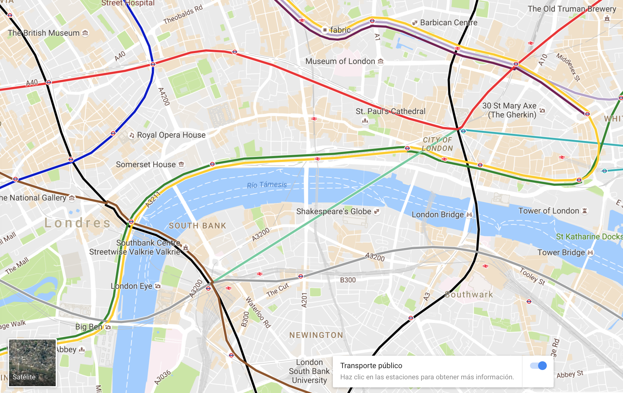
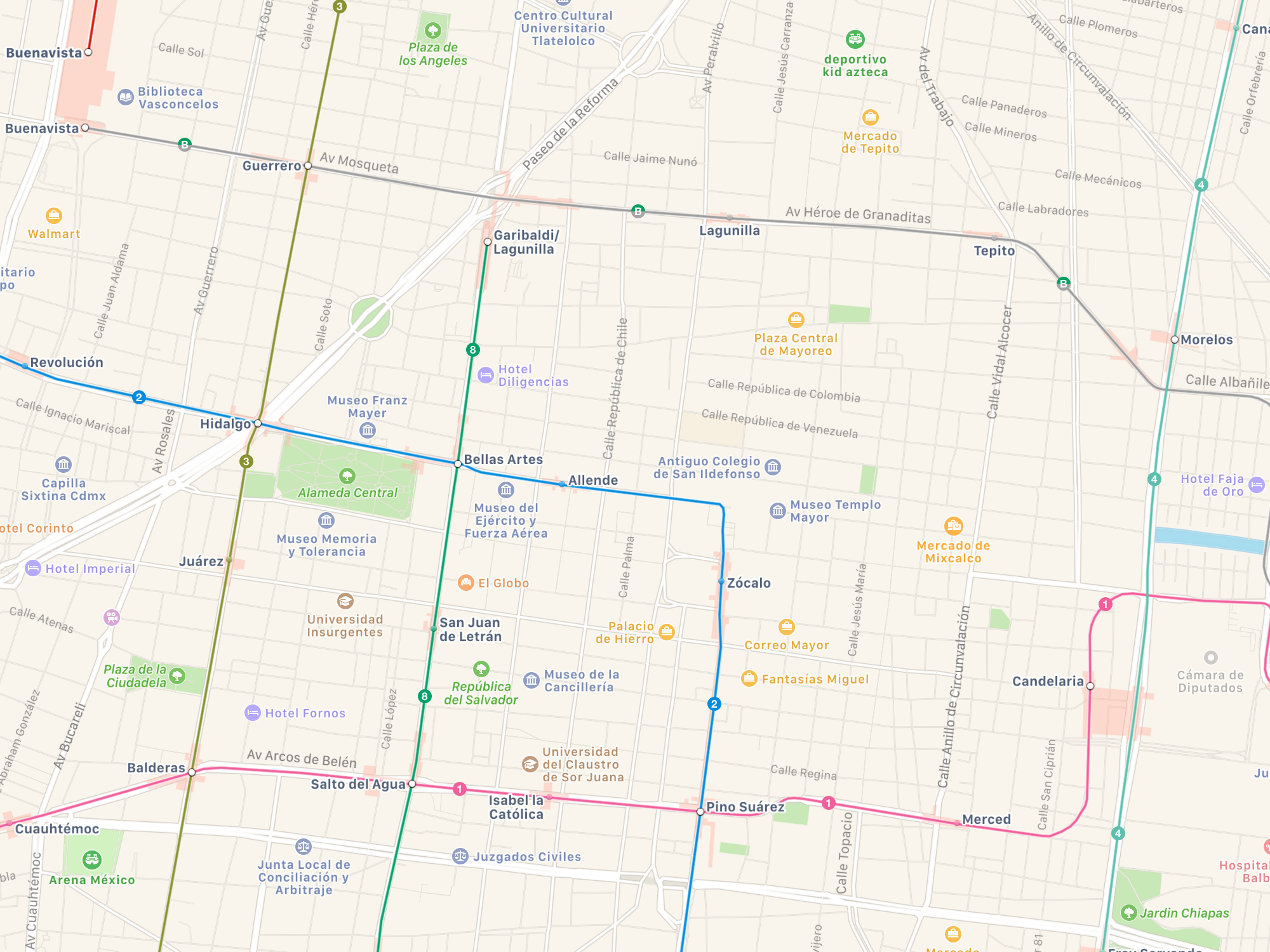
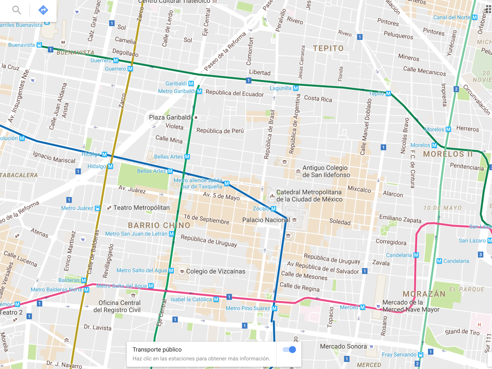
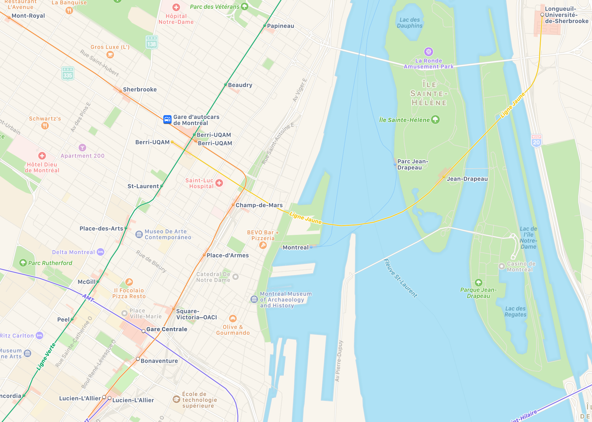
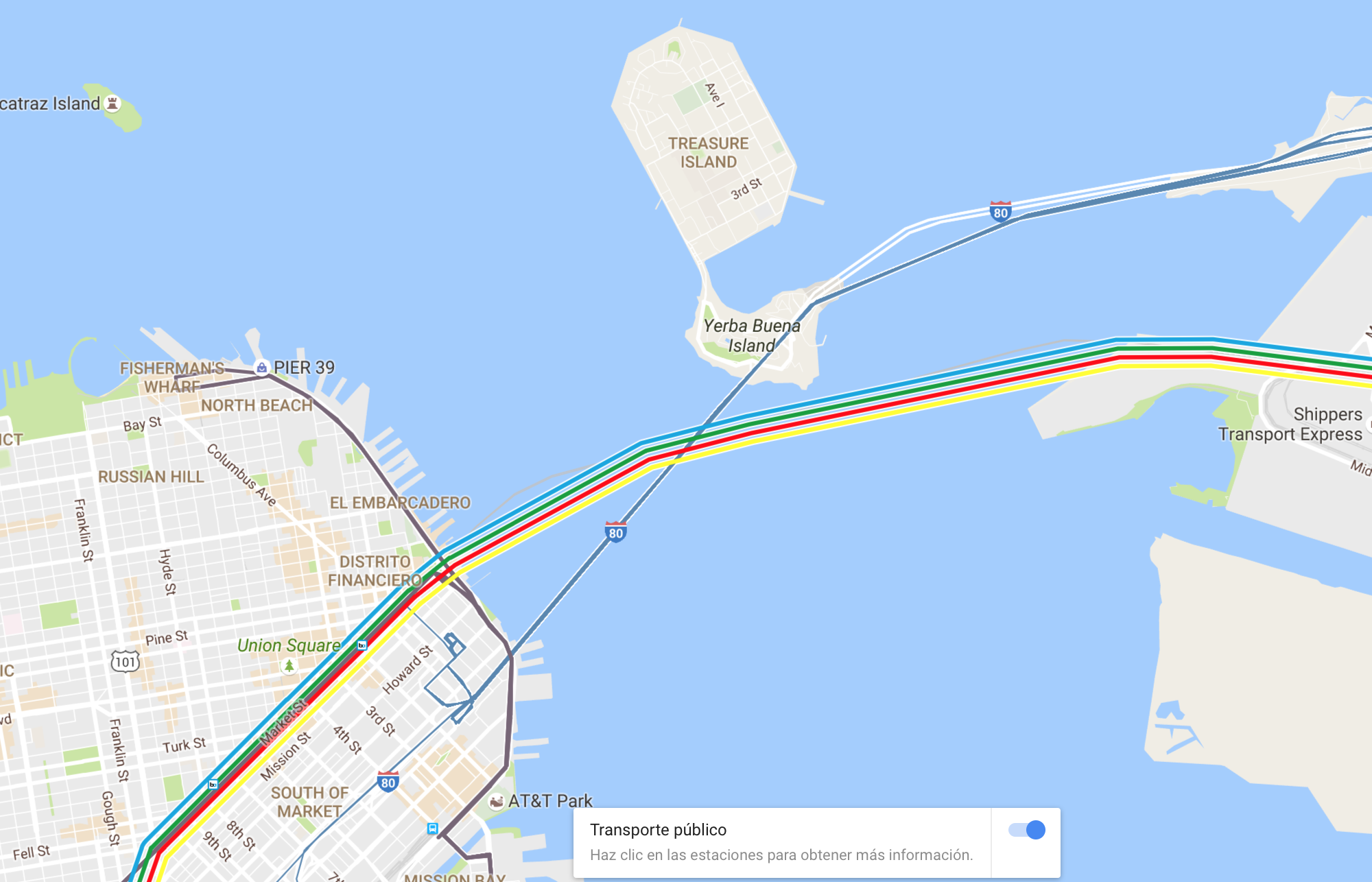
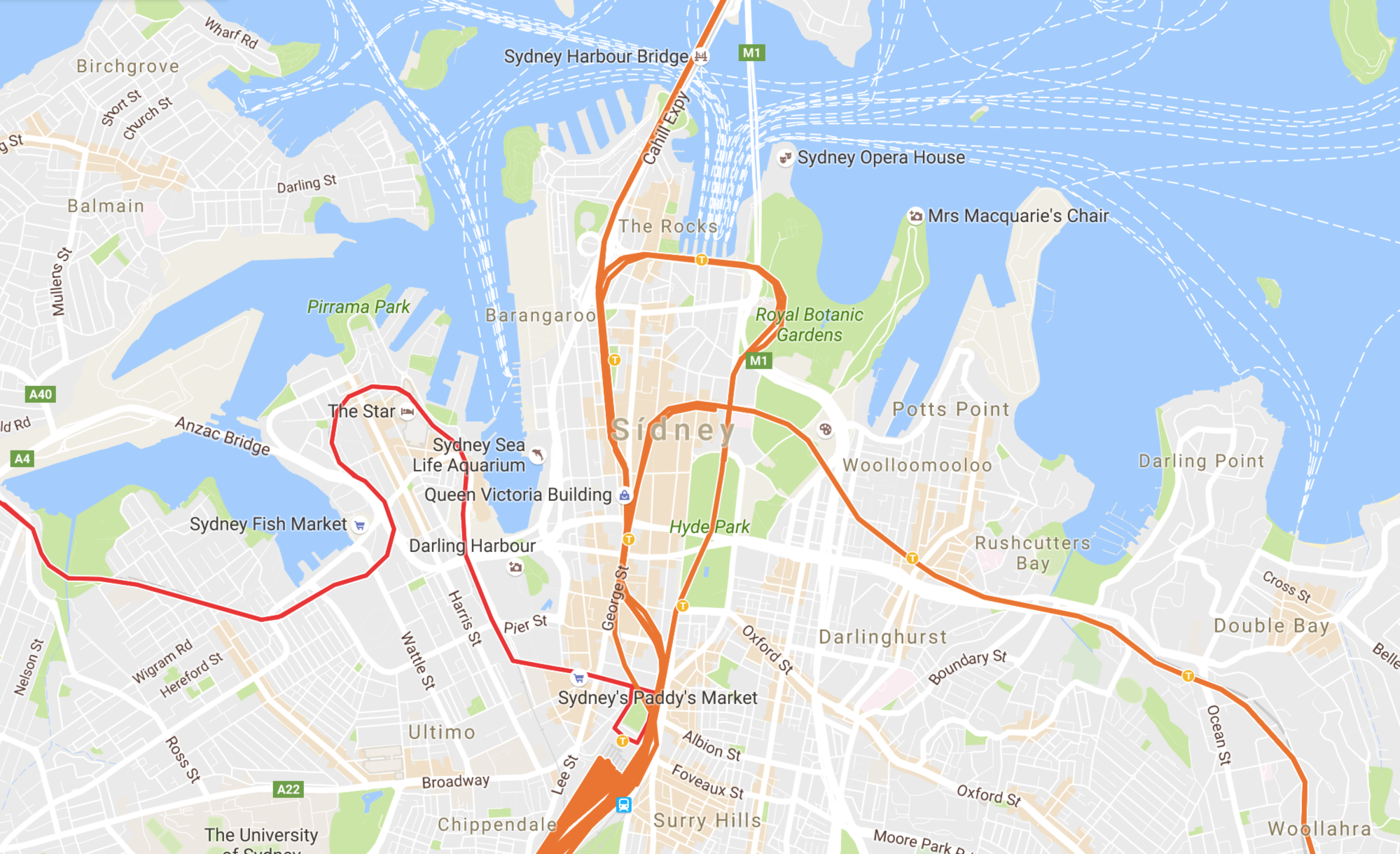
Among other issues, the Google Maps transit layer suffers from discontinuous, crisscrossing and jerky lines, too much an emphasis on roads, badly placed and coloured labels that are often unreadable, repeated or missing, a lack of line and station names on most zoom levels, and a complete lack of the clean look of the standard Google Maps layer. On Map Maker countries the information is also awfully inconsistent, with duplicated stations, wrong categories, misspelled names, different capitalisation styles and a lot of extraneous information (e.g. ‘Metro xxx’ to refer to a station named xxx).
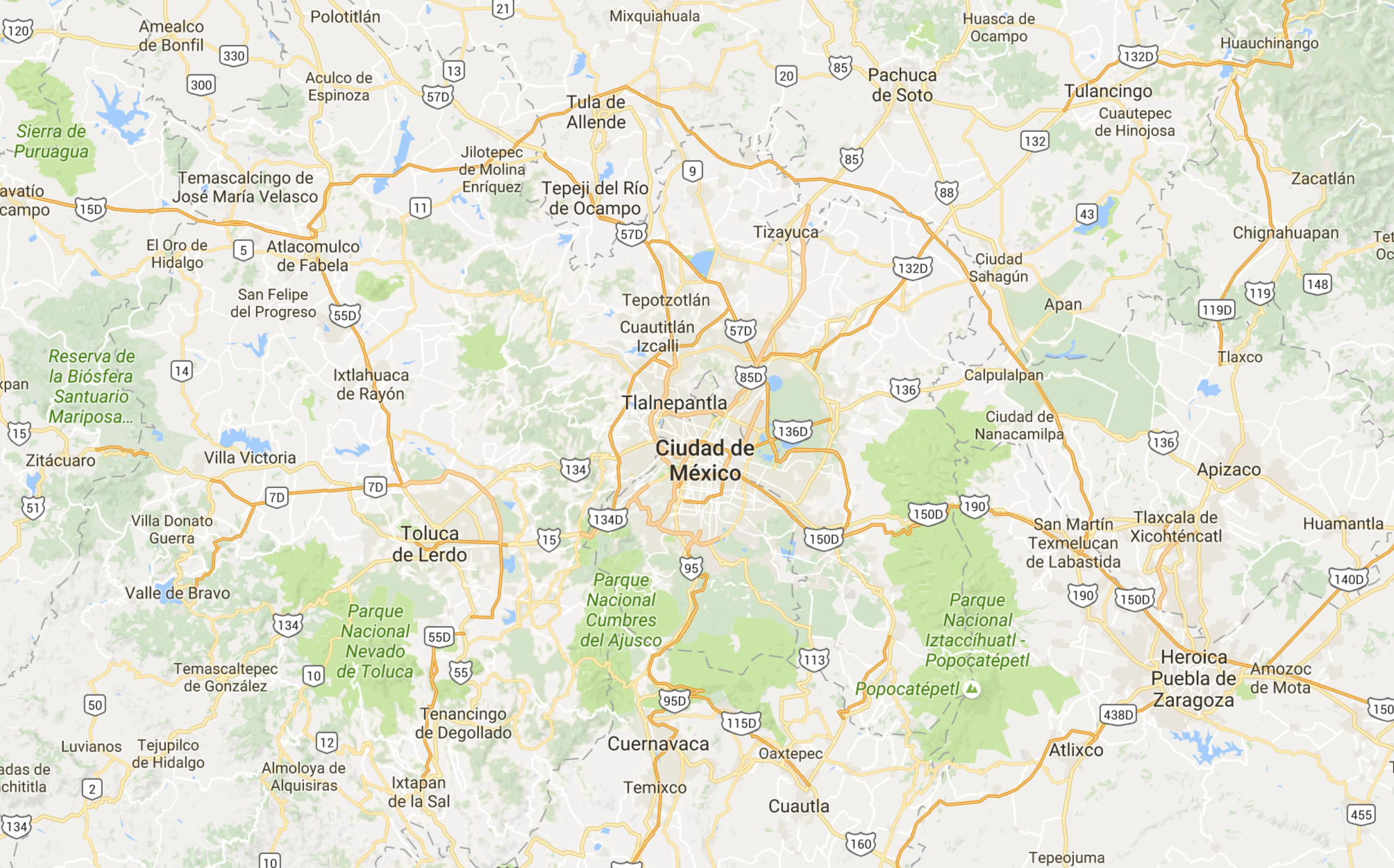
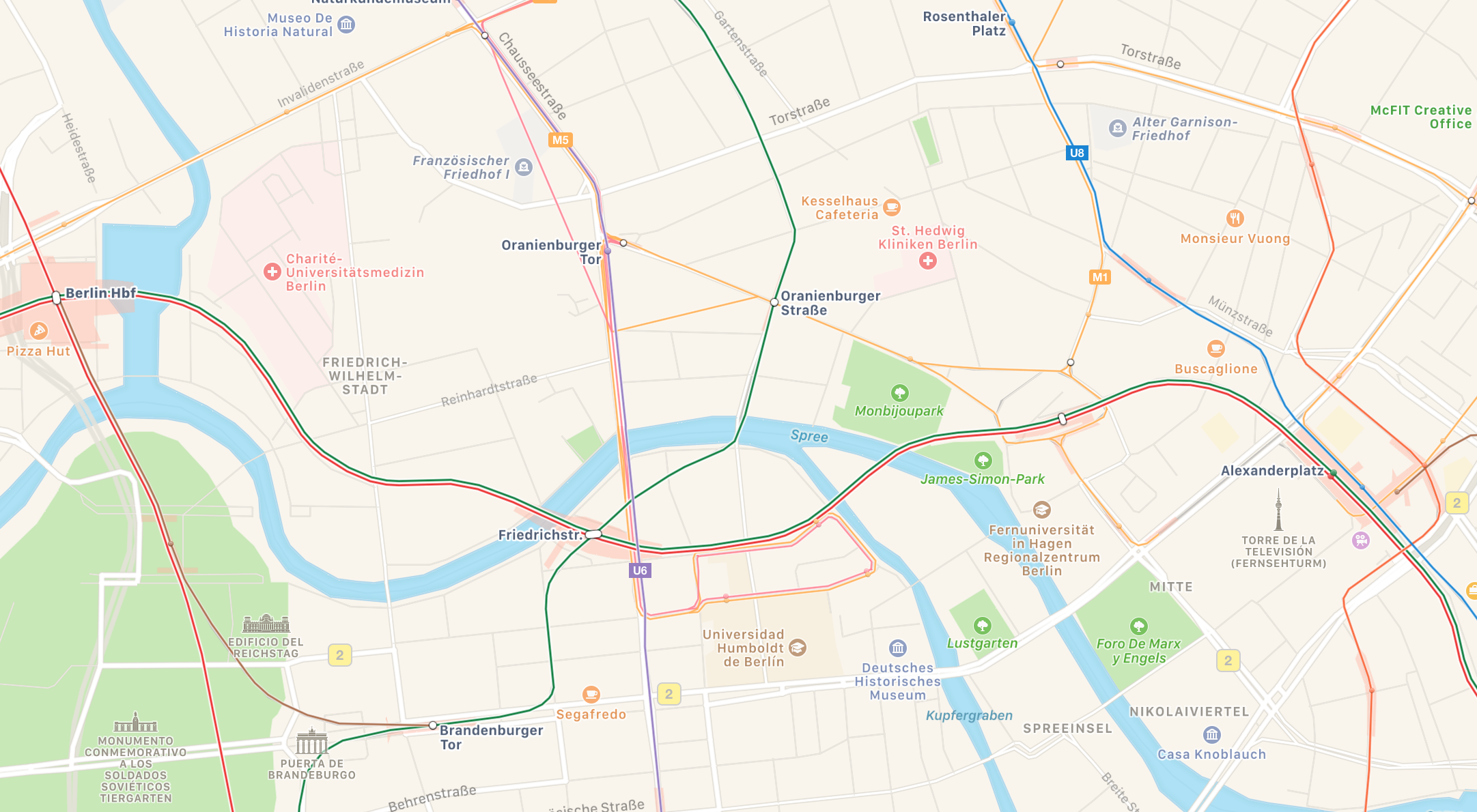
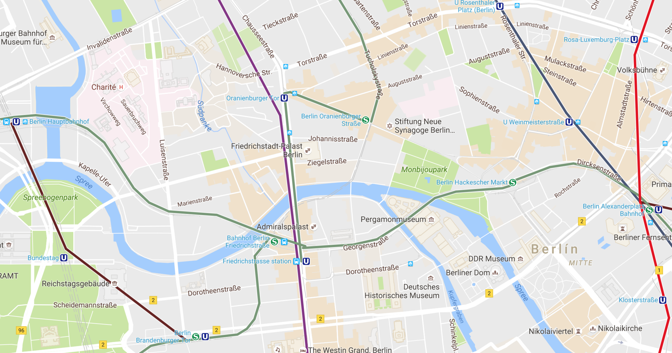
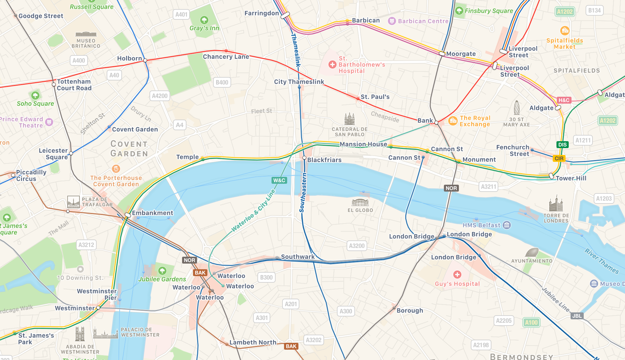
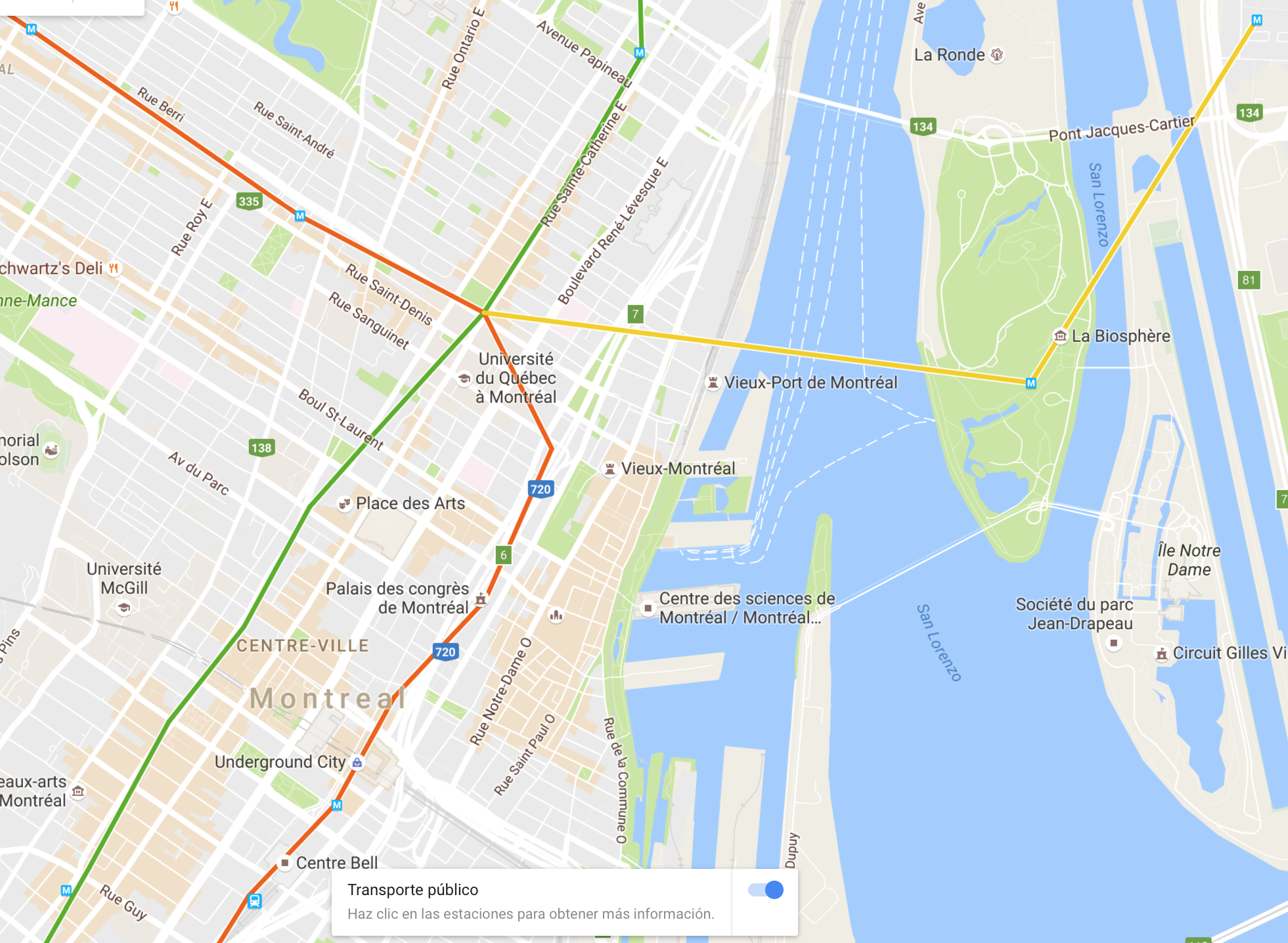
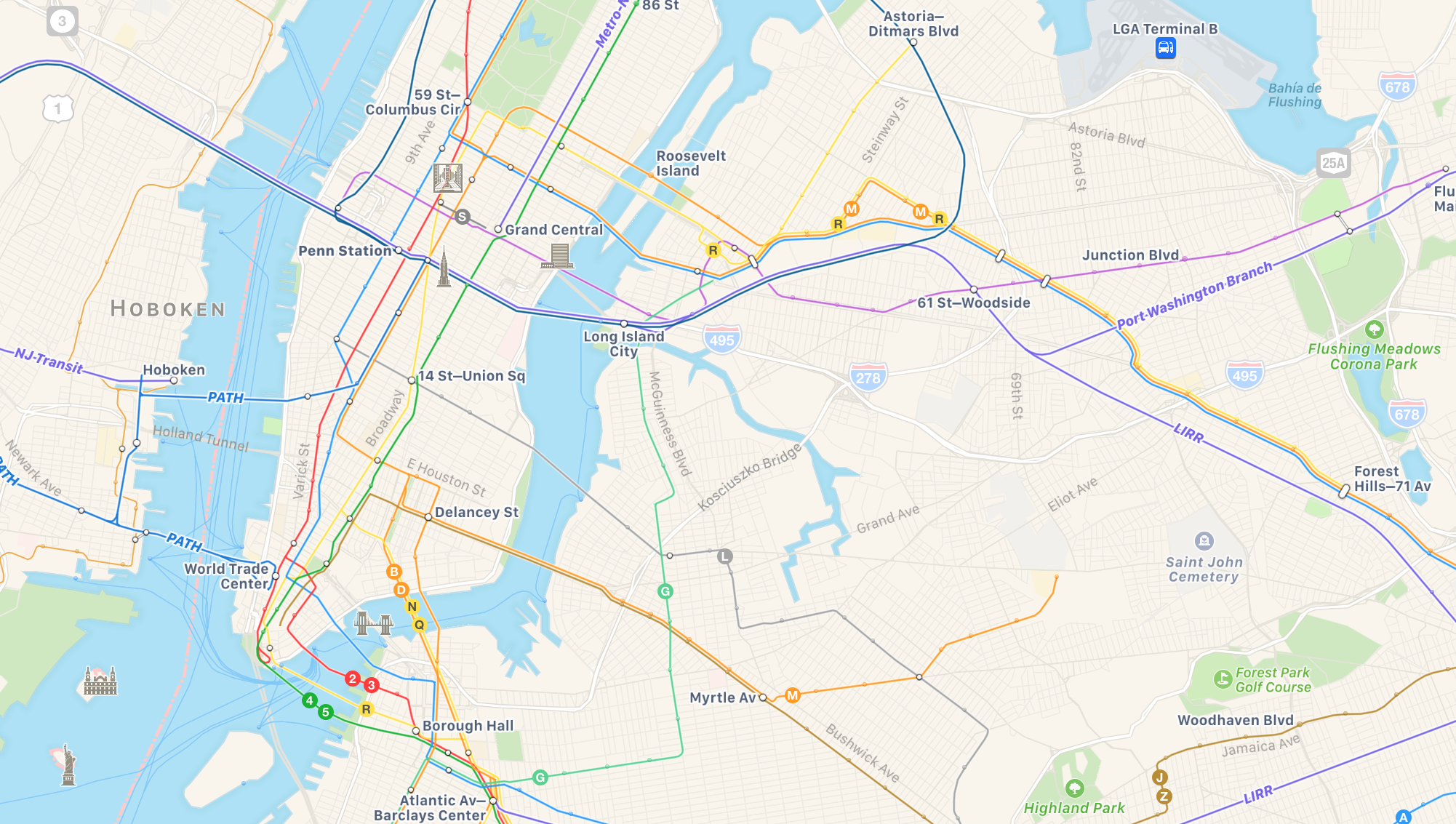
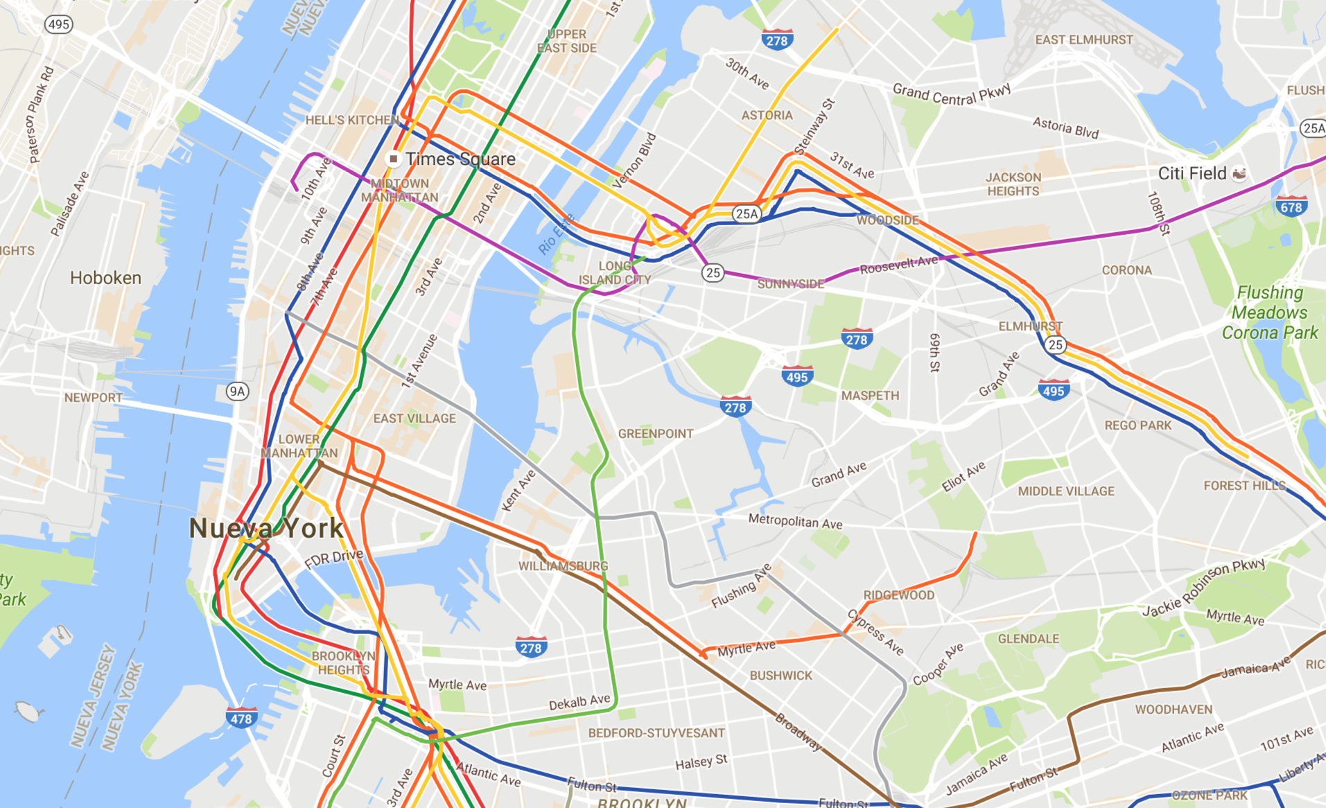
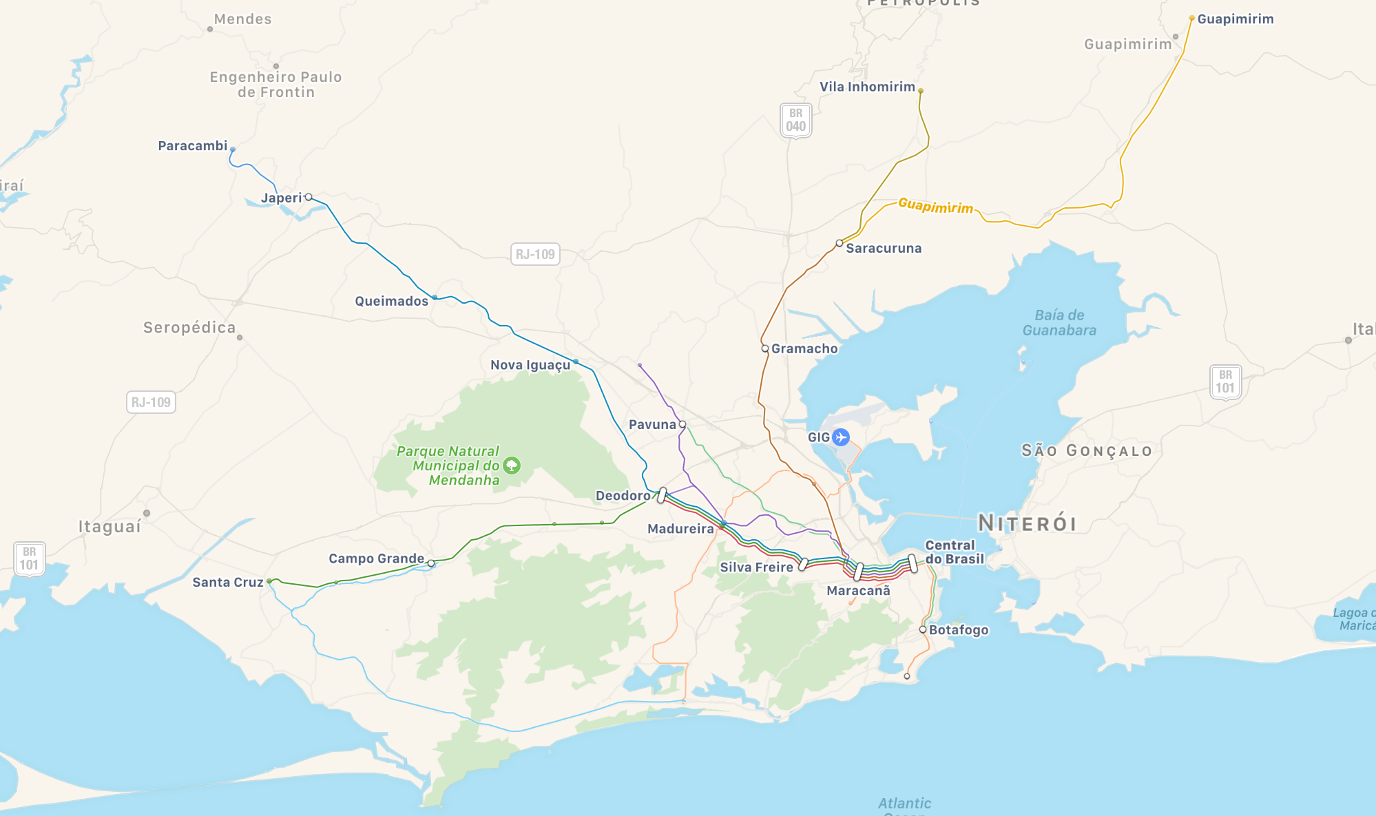
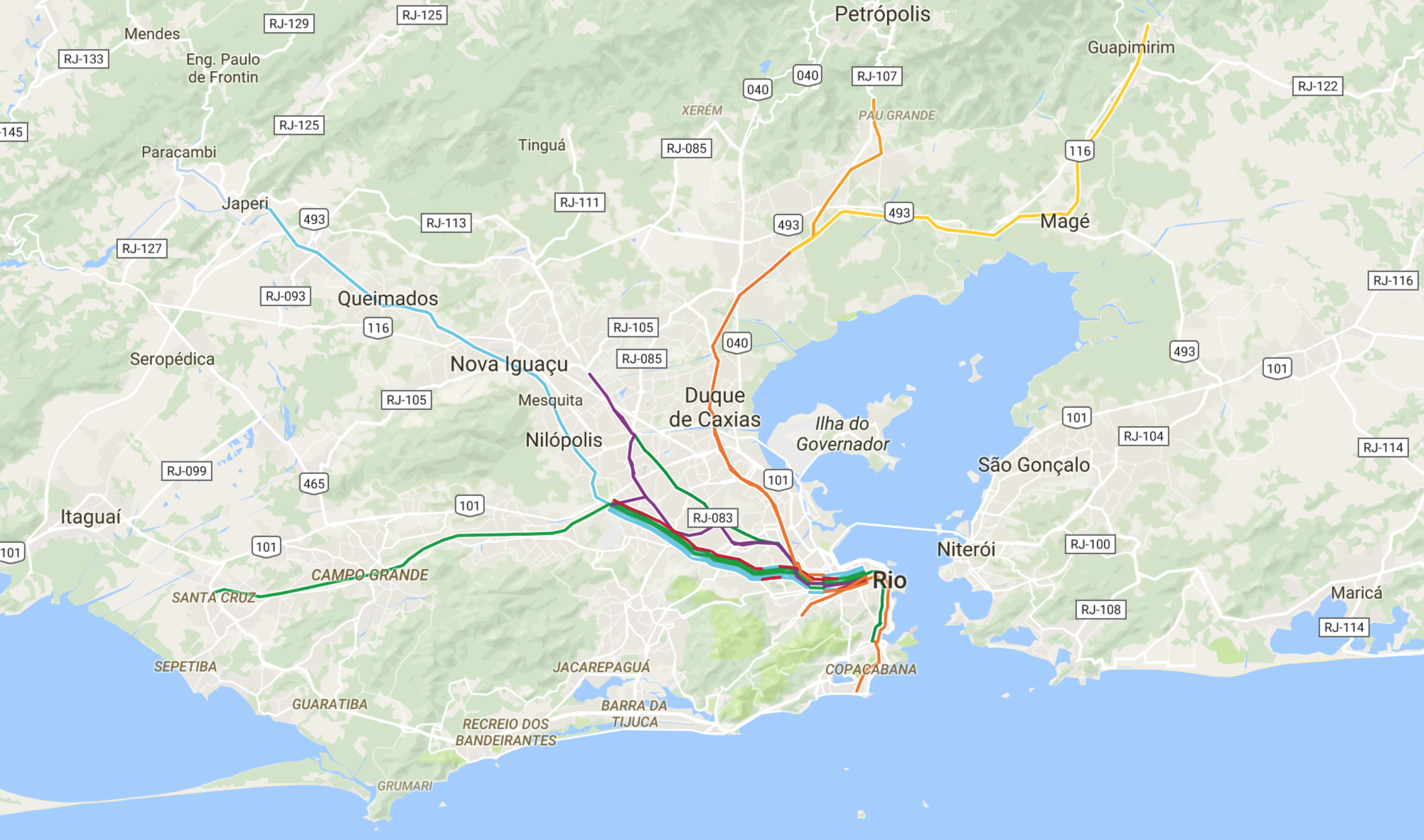
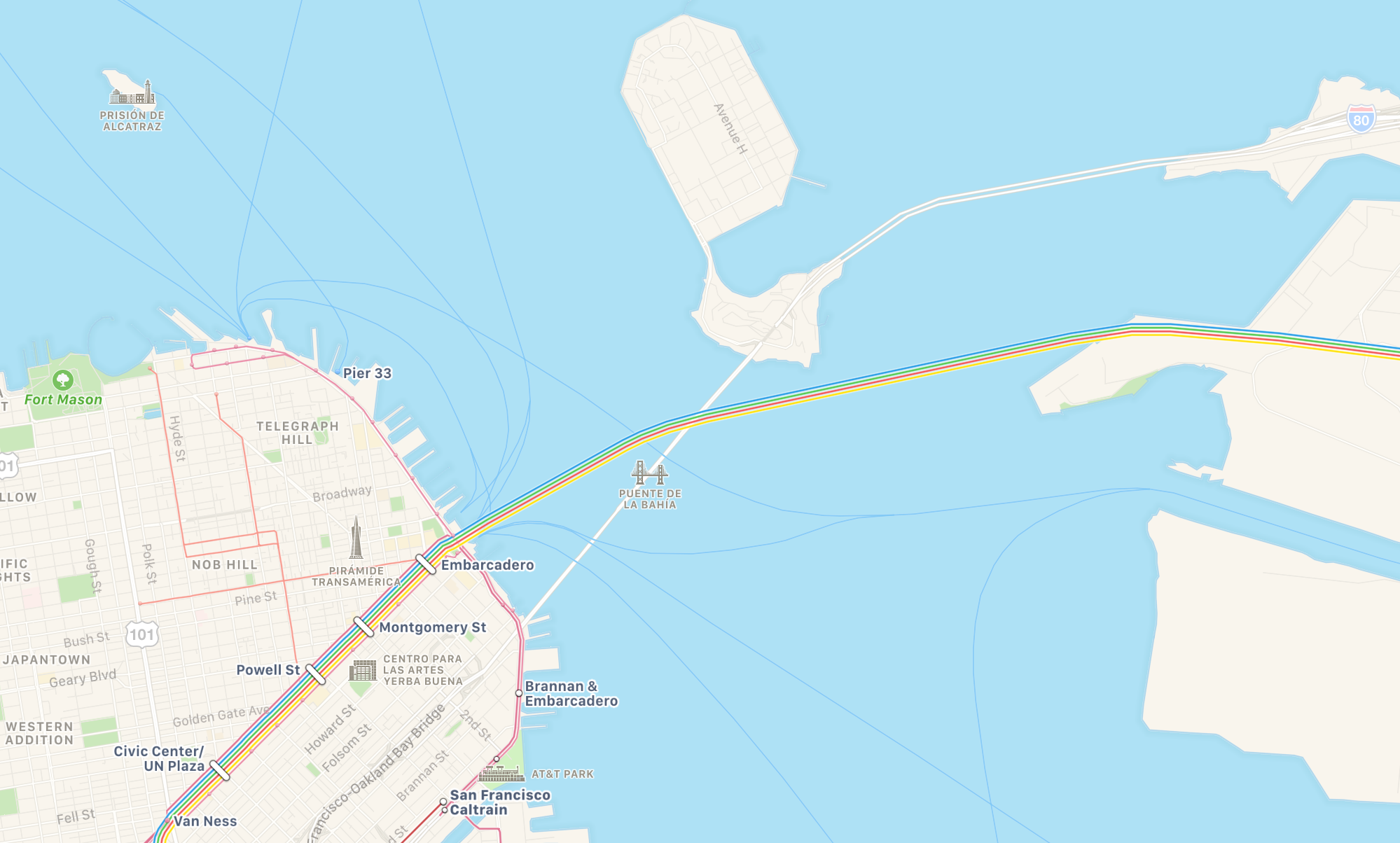
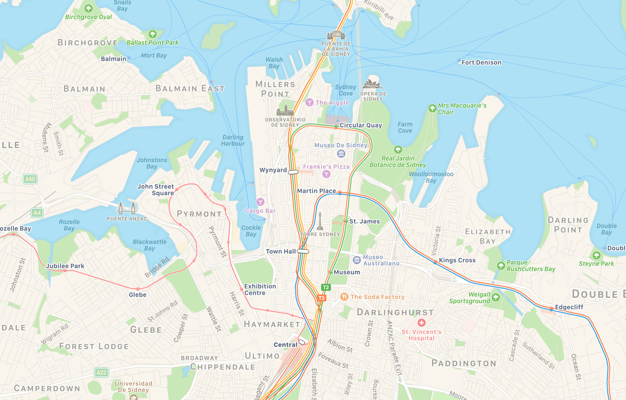
But don’t take my word for it. Instead have a look at the screen caps below, which compare the pretty good public transport layer in Apple Maps1 (above) and the awful one in Google Maps (below) in various cities and at different scales. I’m sure you’ll see a multitude of problems too.
Berlin
London
Mexico City
Montreal
New York City
Rio de Janeiro
San Francisco
Sydney
-
Admittedly, this is one of the few areas where Apple Maps is significantly ahead of Google Maps. Apple Maps’ coverage is rather spotty though. ↩