#30DayMapChallenge
Nov 22, 2022
I contributed 3 maps for my research group’s joint effort in the #30DayMapChallenge. They’re posted in the group’s Twitter, but I’m linking the results from here as well.
Day 10: OpenStreetMap

This map shows the number of buildings footprints available in OpenStreetMap per H3 cell. It’s interesting to see that some regions of the world are much better mapped than others and that the data doesn’t correlate so much with population or wealth.
The script to generate the data is available here.
Day 21: Kontur population dataset

This map shows the world’s biggest cities, as independently computed from the Kontur population dataset. The first step was to classify all H3 cells into urban and non-urban based on a population density threshold (default 5000/km^2). Urban cells are then aggregated into cities as long as they form nearly contiguous regions (up to a maximum cell separation threshold).
Because of the methodology, it is possible to generate the world’s biggest cities using a uniform standard, which contrasts with the inconsistent way in which different countries compute their own statistics. If you dislike urban sprawl as much as me, you’ll be pleased to see that this map shows the true nature of suburban development.
The script to generate the data is available here.
Day 23: Movement
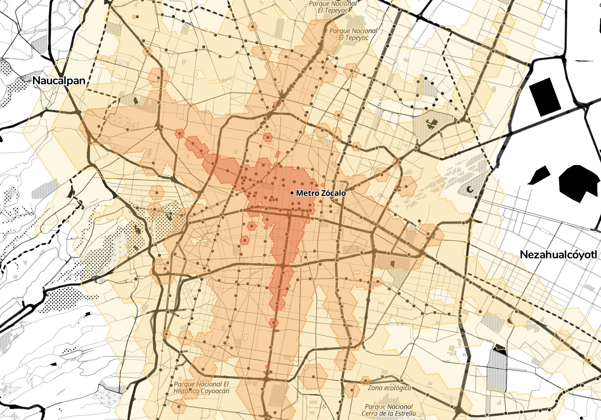
This map, inspired by Chronotrains, shows how far you can travel in Mexico City using public transit in an hour using precomputed isochrones (15-, 30-, 45- and 60-minutes). The isochrones are computed for all metro, BRT, light rail, suburban train and cable car stops using data from the Mexico City static GTFS and a custom method.
The code to generate the map and compute the isochrones is available here.